I’ve always liked tools that push you to create without overthinking. One night, I came across Squibler’s “Most Dangerous Writing App.” It had one simple rule: if you stop typing, your words vanish.
That pressure turned out to be productive. I figured: why not build my own version? Something simpler, faster, and a bit more modern. A minimal tool that does one thing really well.
This was also a good excuse to play with some web dev skills. The goal was to build something usable, publish it quickly, and learn from the process.
Core functionality and goals
The app had to do three things well:
- First, set a timer.
- Second, let you type freely in a focused editor.
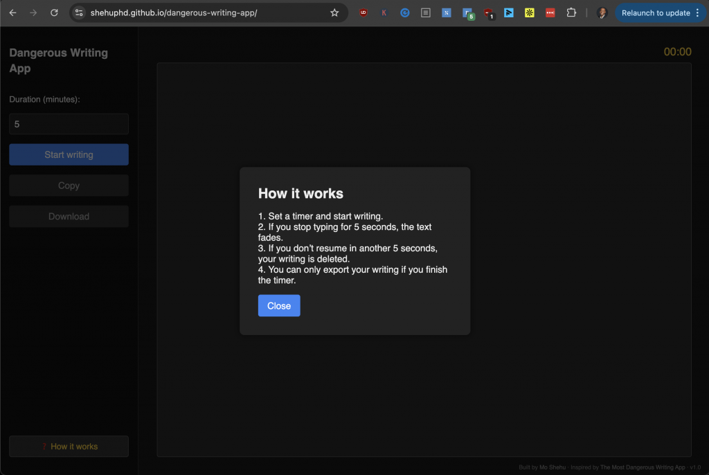
- Third, punish you gently if you stop typing. After five seconds of inactivity, your text begins to fade. If you don’t resume after another five seconds, it vanishes. This forces you to keep going without getting stuck.
The “Copy” and “Download” options only activate once you complete the full session, so you’re rewarded for finishing. It’s a simple game mechanic, but it taps into a powerful sense of urgency.
Design choices
I started with a basic two-panel layout: sidebar on the left, writing area on the right. It felt familiar—like most text editors—but with less clutter. The sidebar holds the timer input and control buttons. The main editor is clean and centered.
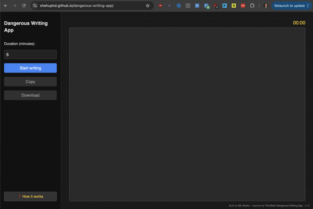
I avoided bright colors. Black and grey backgrounds help reduce eye strain, especially during long sessions. I also added a modal for the “How it works” section, triggered from the bottom left.
On desktop, the layout stretches nicely. On mobile, it stacks vertically and shrinks all interface elements to avoid taking up too much space.
Challenges faced
Several things broke along the way:
- First was the writing timeout logic. Getting the exact sequence right—fade at 5 seconds, delete at 10—meant juggling multiple timers and resets.
- Then came the GitHub Pages deployment. The repo had a remote mismatch that rejected my first push. I had to reconfigure the origin and resolve a fast-forward error.
- Another pain point was mobile responsiveness. The sidebar looked fine on desktop but bloated the screen on phones. I had to restructure the layout using media queries and simplify button sizes.
- Even tiny issues—like making sure copy/download buttons only activate after time is up—took more thought than expected.
Improvements made through iteration
Most of the polish came from trying it myself and fixing what annoyed me:
- I made the timer auto-start when typing begins, which removes one step for the user.
- I added a subtle footer to credit myself and link to the source. The “How it works” guide was initially too hidden, so I brought it forward with a visible button.
- I also tweaked the red fade animation to be smoother.
Final stack and architecture
I didn’t use any frameworks, just raw HTML, CSS, and vanilla JavaScript. The structure is a single-page layout with one script and one stylesheet. I kept things modular in CSS using sectioned comments and media queries. Hosting is done through GitHub Pages, which keeps things light, transparent, and easy to share.
Lessons learned
One of the biggest lessons was how much UX clarity matters. If a button looks clickable but doesn’t work yet, that’s frustrating. So I greyed out the copy and download buttons until the timer ends.
I also learned the value of instant feedback. The red fade isn’t just a gimmick—it gives you a moment to get back on track before losing everything. That’s more forgiving than the original Squibler version, and I think it’s a better user experience.
Designing for mobile first also forced better choices. Smaller buttons. Responsive stacking. Cleaner layout. All good habits.
Future improvements
There’s more I’d add:
- First, autosave. Right now, if the browser crashes or you reload by accident, it’s all gone.
- Second, I’d like to add optional sound alerts—maybe a tick when you’re idle.
- Third, export to markdown instead of plain text for those who want to format.
- Fourth, a full-screen mode that hides everything else.
- And fifth, analytics. I’d like to show users how many sessions they completed, their average duration, and maybe a word count tracker.
These are all doable without making the app feel bloated. The challenge is keeping the same focused experience.
Links and references
Live app: https://shehuphd.github.io/dangerous-writing-app/
GitHub repo: https://github.com/shehuphd/dangerous-writing-app
Built by: Mo Shehu
Total build time: < 3 hours
